Wine label design for Bodegas Valbusenda

Client
Valbusenda
Category
Pack
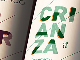
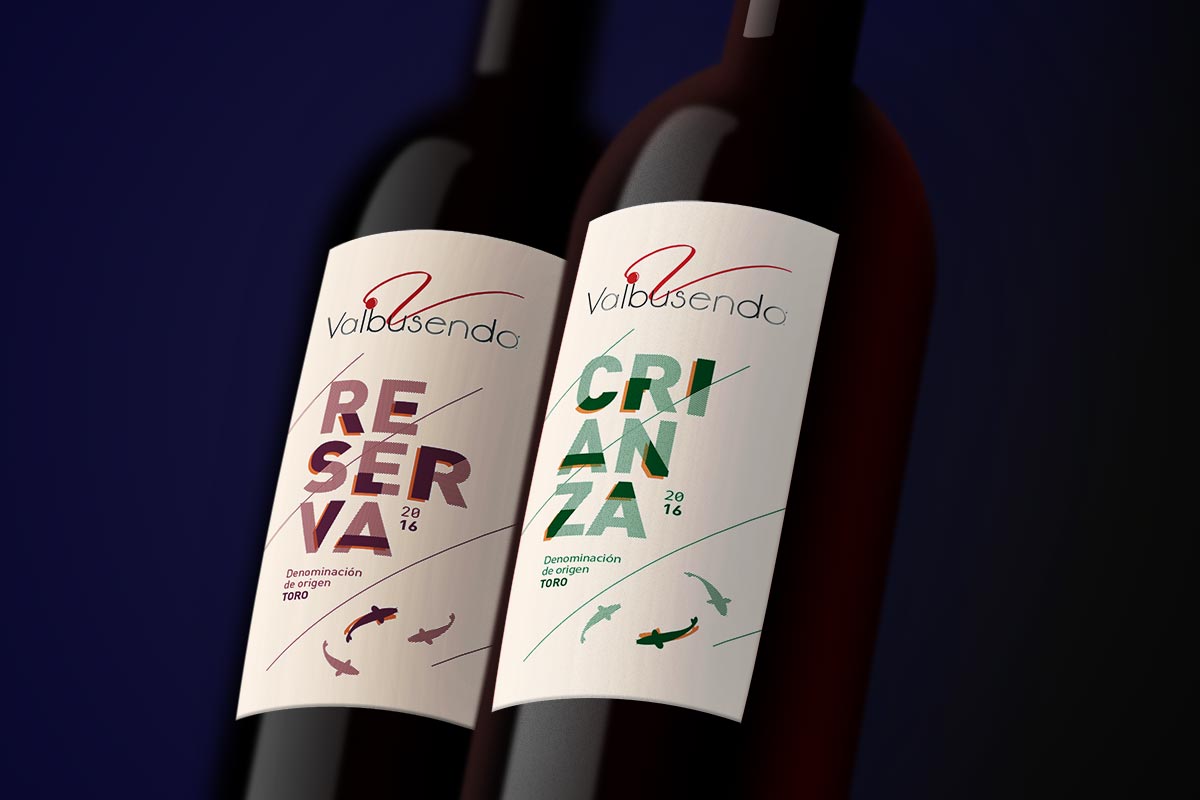
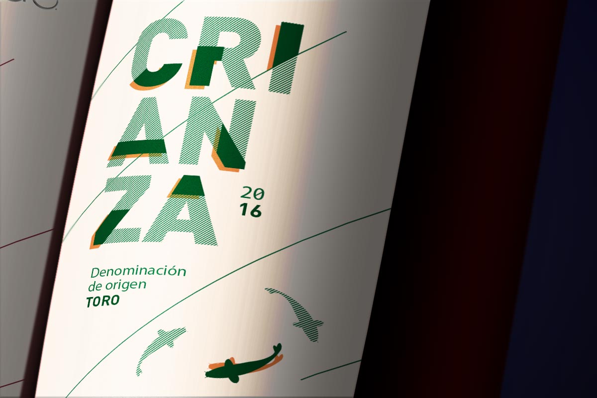
For this wine label design we took the strong architectural nature of the brand as a reference, opting for a composition based on the overlay of diagonals with geometric elements.
With the cream background representing the earth, we positioned the name of the wine variety in tones that bring added visibility. This play of colours varies on the different labels so that each of them can be identified easily.
To associate the organic element of the wine with Valbusenda, we decided to add in our proposals the carps that inhabit the winery’s lake as a graphic feature, further enhancing the personality of the label.