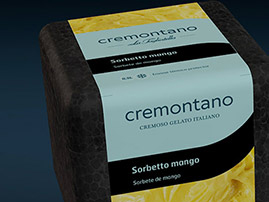
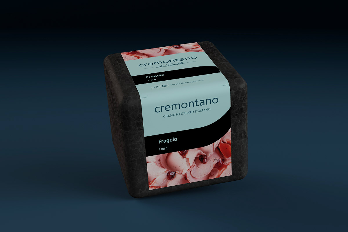
Design of packaging for Cremontano ice creams


Client
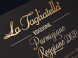
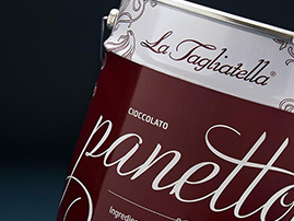
La Tagliatella
Category
Pack
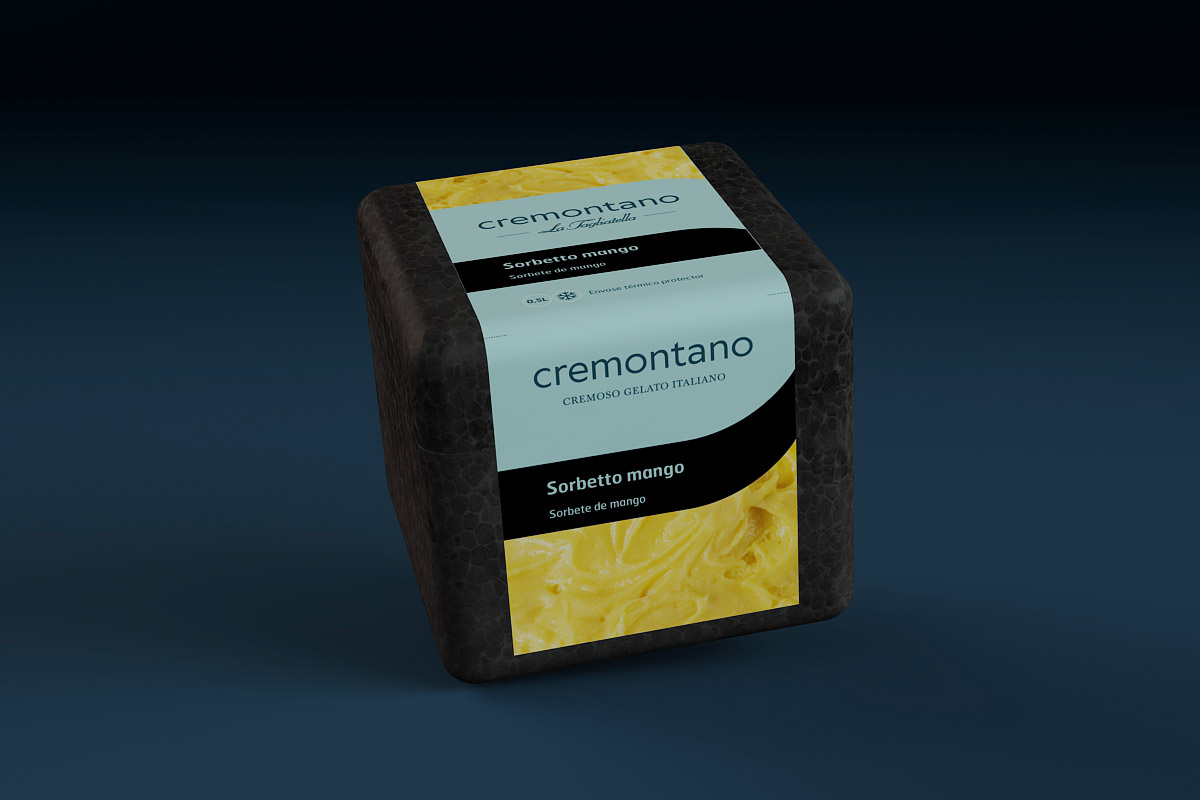
The first thing we had to take into account when planning the packaging for the Italian ice creams for La Tagliatella restaurants is the fact that their sales channel is quite unconventional: they are only sold through an app. Consequently, as the usual criteria on which customers base their purchasing decisions in a standard retail outlet do not apply, our approach to the project had to be different.
Bearing in mind this determining factor, our packaging design for the twelve flavours of Cremontano featured the corporate aquamarine in an elegant contrast with the black box. To illustrate the packaging design, we held a photo session to emphasise the creaminess of the ice creams.