Packaging design for Wan Light juices


Client
Wan Light
Category
Pack
Wan Light launched a range of fruit juices aimed at young consumers: open-minded shoppers who are looking for something different and eye-catching when they visit a supermarket, which doesn’t mean they are not also looking for a top quality product.
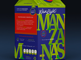
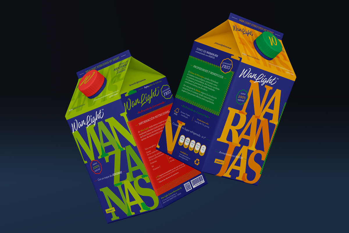
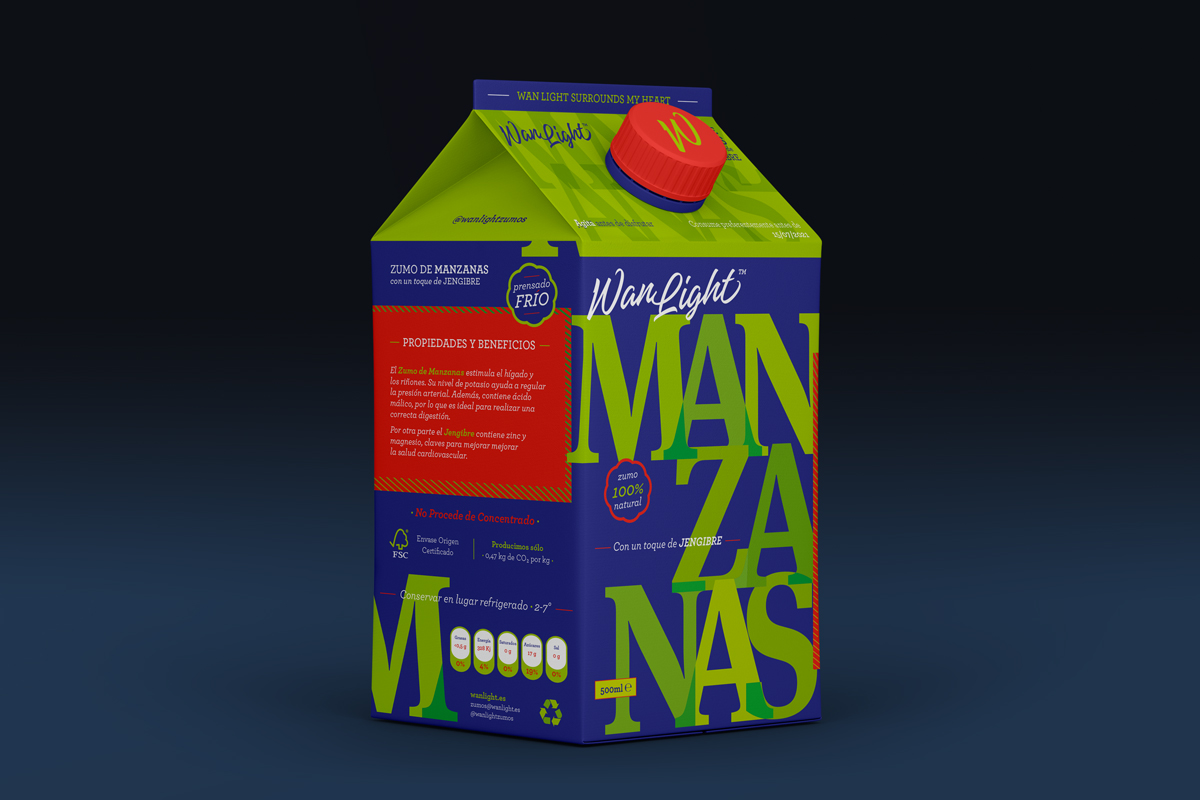
We therefore knew that our target market was open to more ground-breaking advertising codes which in the absence of the elements traditionally used in packaging design – photos or illustrations of fruit – would receive a good response. To ensure that the juices would leap from the supermarket shelf into their shopping cart, we used some very unusual graphic resources: a strong colour palette in which the colour of each variety really popped against a deep blue background. To reinforce the desired result, we opted for the power of a really robust font.
The brand’s original offering consists of two juices: apple with a touch of ginger, and orange flavoured with mint. They are about to be joined by yuzu-infused redcurrant as a special edition only available in the summer months.
This packaging design project has been reviewed by:
- Packaging of the World (USA)
- Favourite Design (France)
- ออกแบบบรรจุภัณฑ์ (Thailand)
- Instagram FD (France)